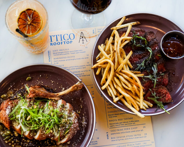
Menus: Underrated Design
One of the main reasons why I’m glad I chose to major in Advertising is that it taught me to appreciate product design. People usually don’t notice the shape of a shampoo bottle or a tube of lip gloss as “art”, but AD has taught me to see the thought process behind the designs. Like Hiroko Sanders’ Summer Kleenex boxes, form doesn’t have to just follow function–it can impart emotion and breathe life into the product. So as an Art Direction kid I may get real nerdy over typefaces, but at least I also appreciate lots of underrated kinds of design, like restaurant menus.
Everyone who goes to a restaurant has to look through the menu at least once, yet its often overlooked by restaurants that just throw pictures of food against a neutral background, list the food and prices and call it a day. They kind of remind me of posters in that they are advertising that’s almost purely informative. But menus aren’t just about the food; they’re the brand of the restaurant. Here are some examples from The Inspiration Blog and iDesign Now:


