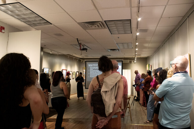
Graphic Designing for Fine Art
My experience creating promotional materials and designs for Alfa Art Gallery
The Experiences of Temple Advertising Students

My experience creating promotional materials and designs for Alfa Art Gallery

Hi, my name is Patty Leardi. I’m a senior advertising major with concentrations in Copywriting and Brand Strategy. I have been a research/content coordinator intern at This Is It Network throughout my summer break and fall semester. This Is It…

My name is Jack Janson and I am an Advertising major with a concentration in Art Direction. I am currently interning at one of my favorite clothing brands, Cream by Eighty here in Philadelphia. This experience has not only taught me so many skills from product photography and promotional videography to clothing design and manufacturing, but it has also given me the confidence to start my own brand, fulfilling one of my biggest dreams.

Hello Owls! As a sophomore advertising student with a concentration in media planning, I spent loads of time looking for an internship that would be meaningful for the career that I desire to pursue. I landed a summer internship at…
My name is Gabrielle and this semester I had the pleasure of working at The Lenfest Institute located on Cecil B. Moore Ave. The Lenfest Institute at Temple University is a part of the North Philadelphia Workforce Initiative and is…
LightStream Group is a marketing agency concentrated in bank and credit union, healthcare, and higher education advertising. The organization has two locations, one in Lansdale PA and another in Telford PA, both suburbs of Philadelphia. They currently have just over…
https://www.youtube.com/watch?feature=player_embedded&v=pfxB5ut-KTs Evian strikes gold with another spot focusing on their “Live Young” branding and providing us with yet again a video featuring adorable babies, Evian’s signature. This time, instead of just showing the inner child that Evian’s water brings…
American-based “Hipster” brand American Apparel is well-known for three things. First, their severely overpriced, essentially cotton garments (leggings, dresses, v-necks, glittery spandex bodysuits, and the like). Second, they’re well-known for their provocative, borderline pornographic advertisements (see some examples below). And…
I continued to look through the April issue of GQ magazine. The “special issue” consists of 100 different “hot” things in the year 2012. They have everything from all the best clothes to tips on how to do everything better.…
I was walking around this past weekend and saw on the newsstand an interesting magazine cover. I talked about this in the past but I constantly see magazine companies playing around with their magazine covers. The Glamour Magazine has…
After looking at the Glamour Magazine cover, I was thinking about something. Nudity. We see from time to time magazine covers with nudity. I understand that sex does sell and it gets the reader to buy the product. But my…
I continued to look through Detail Magazineand found something interesting and very different. I don’t know if any of you followed Ray-Bans print advertisements but they had series of Ray-Ban campaigns. There had series of interesting campaigns done by the…
Students at Temple see thousands of advertisements on campus each day. Some are hung on bulletin boards; others are passed out on Liacouras Walk. But the ads and event posters hanging in the Louis J. Esposito Dining Center and the…
This week, I took a look at the April 2012 issue of Detail Magazine. In this magazine I found an advertisement that I’ve seen many times before. I was thinking about whether or not I should talk about this…
This week I decided to take a look at Women’s Health magazine. I don’t particularly look at Women’s Health but I decided since I looked through Men’s Health, I would do the same for all the women out there. In…
I continued to look at Women’s Health this week, the April 2012 issue with Kristen Bell on the cover. I found another advertisement that I thought was cool. I rarely see advertisements for LifeSavers Mints but in this magazine I…
This week I continued to look through GQ magazine (March issue) and came across an advertisement that seemed a bit off. We all know that little lizard from Geico. Well, in this advertisement they are using their phrase “15 minutes…
Most clothing and/or fashion brands highlight women enjoying leisure and the finer things – but Athleta is not just any women’s apparel brand. Bought by Gap Inc. in 2009, the brand has said to use Nike’s style as a reference…
On the same issue of Us Weekly (February issue), I found another advertisement that I found interesting. It was a sweepstakes advertising for Stride and Trident gum. Well, come to think of it, it may not be that interesting however, it…
Just a little update on the previous 3191 miles apart post! 3191 Quarterly: issue no. 6 is now available for you to hold in your hands! ” [the issue] includes features on cocktails, hanging plants, chocolate cake, London & Stockholm, forging,…
I came across the Glamour magazine and saw that Rachel McAdams was on the cover. But besides that, I realized there was so much copy on the cover I can barely decide what to read first. So I decided to…
So this Sunday is THE day when we get to see the Super Bowl XLVI. When the Super Bowl comes near we know the best advertisements of the year will be making it’s appearance. If you look at Adweek, you…
3191 Miles Apart is a blog started by Maria Alexandra Vettese and Stephanie Congdon Barnes. Both Photographers, Art Directors, Stylists, and Designers. The two creatives met back in 2005 and in 2007 started their first project of diptych photographs: “A year of mornings”,…
We all know that high-end fashion print advertisements seem to have nothing to do with fashion. They usually portray bunch of people doing random things that seem to make no sense what’s so ever. For example, Louis Vuitton has print…
Before I dig into these ads with my thoughts, I want to say that I fully support this cause. Philadelphia is notorious for being very unfriendly to it’s large bike population. We completely lack bike lanes which are crucial to…
Treating solids as a kind of typography, French artist Armelle Carnon created a series of poster-style flat wall prints that seek order in the chaotic spirals, winding alleys and misshapen squares of famous cities. A strange and unique, but surprisingly alphabet-like,…
The bottom reads: “Historically Hardcore.” What a great angle- especially coming from an institution as regarded as the Smithsonian! Check out two other examples on the most excellent Behance Network. Update: I wrongly appropriated these ads to the Smithsonian, when…
Information design, AKA infographs, are getting increasingly popular every day, week, month, year. Personally I find them tough to do, basically because it is really easy to make them look cheesy. In this primarily image heavy post I am featuring…
Okay, so Activia has a new campaign that just launched, developed by Young & Rubicam. They are an agency based out of Prague, Czech Republic. I’m sure that they were going for a concept that they wanted to really spark…
After 4 months of work, Arcano Type has finally been released. Totally designed by hand, letter by letter, using Chinese ink on Japanese calligraphy paper. Pretty neat and clean, but super deco-style. I’m not quite sure it’s use yet beyond…
Well this completely relates to the project that most Art Direction two students just finished, and what some graphic design majors are still working on. 1Billion Hungry is a campaign that is a little more edgy than anything City Harvest…
Here’s a throwback design related post. It’s modern with old techniques. It’s been done but it’s fresh. Alberto Seveso is his name, and guess what? He is Italian if you haven’t gotten that from his name or the title already.…
Philadelphia Mob Hit Man John Veasey This composition would make an amazing outdoor installation, but I could understand neighborhood groups not wanting to glorify mafioso (especially since the fascination has died down). It’s credited to mosaic portrait artist, Jason Mecier.…
I’m no expert on Asian culture, but right away I picked up on something about this ad and I could be wrong about it. From my understanding, older women don’t wear their hair down (if it’s long). Instead they have…
This certainly isn’t a vintage ad, but it’s older than you may think. Personally, I can never get enough of those earth tones. Not to mention it’s a beautiful shot. It has an air of sophistication about it. I dig…
The focus remains benefit copy. It's not about what Listerine can do for you, but what may happen if you don't use Listerine.
I don’t think it’s any coincidence that this guy looks like J.J. from Good Times. This ad was placed in the very same month that Good Times went off the air (August 1979). Back then ads probably had a longer…
It looks good enough to frame.
The only place I can think of seeing something like this is old vinyl sleeves (records). This sort effect was common back then.
There are often times when one may see a TV spot run back to back and they may wonder why. Usually, one spot is national and one is local-- usually. For magazines, I really couldn't say. So after seeing not three, but four pop up this time I just had to say something.